
A lot to say.
Too much in one place.
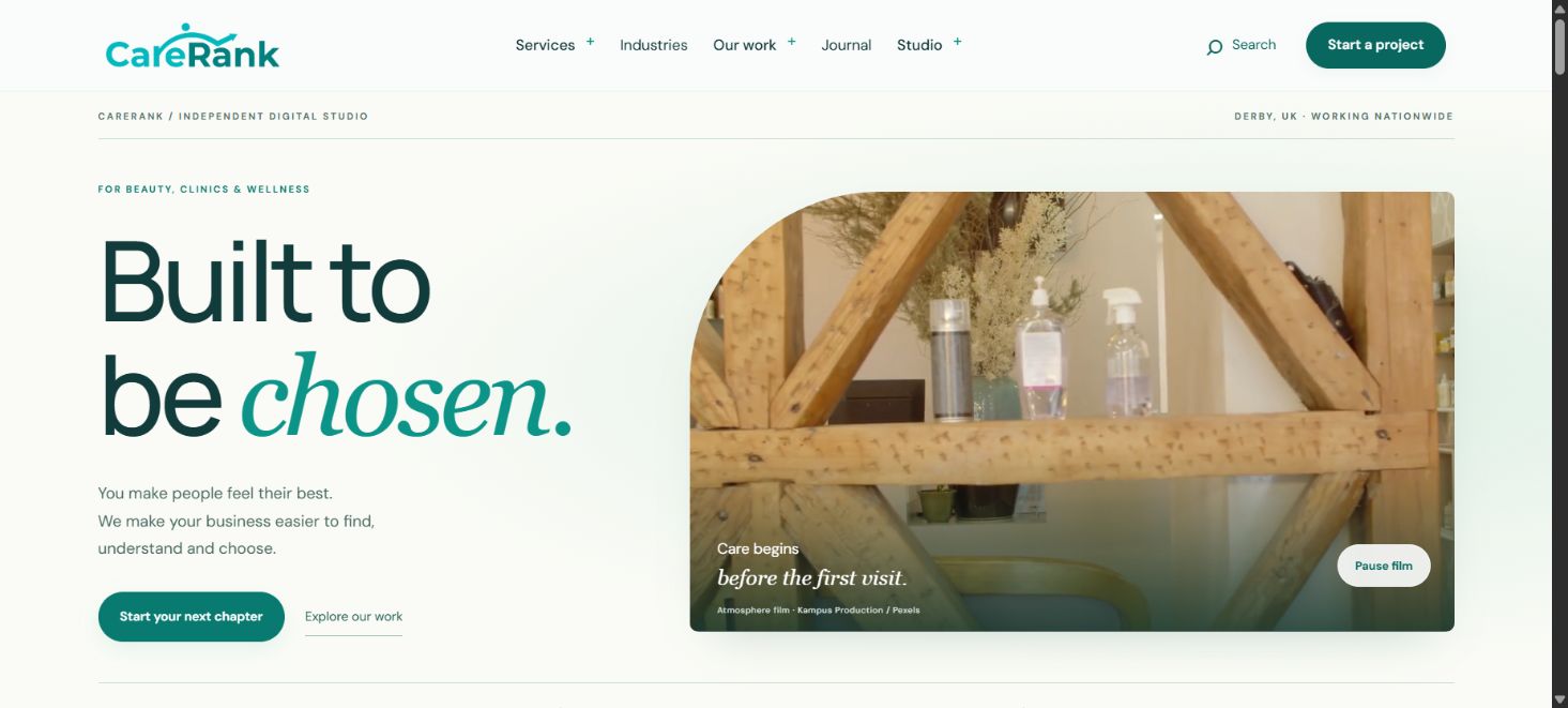
The existing homepage repeats growth, bookings and visibility messages across multiple sections. The first redesign also placed services, industries and contact on one page. The brief evolved towards a distinct, multi-page website with a lighter feel.
Separate the decisions.
The new homepage introduces CareRank. Dedicated service pages explain the work, industry pages provide context, and a separate contact page handles enquiries. Portfolio, case studies and editorial content give interested visitors somewhere useful to explore.
The user-supplied logo and icon remain intact. Teal #0D9488 connects the visual system across pages, while restrained motion adds interest without requiring a heavy animation framework.
A smaller shared image.
The shared still-image file is approximately 93% smaller. This is a file-size comparison, not a measured improvement in page load time. The salon film is also compressed and starts on mobile only when a visitor chooses to play it.
Clear about what we know.
Local page and asset links, JavaScript syntax and selected desktop and mobile interactions have been checked. The website remains a local preview. There are no post-launch booking, ranking or revenue results to report.
Explore the design project